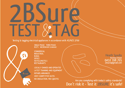


A friend at church asked me a few weeks ago if I'd be able to help him with the branding/designing and production of materials for the business he's starting up. I can't resist an offer like that so last week I went through a stack of designs that I'd done with him and narrowed it down to this one - the cord "&", the grey/orange /white colour scheme and very cool font. The ampersand is my own illustration, if you were wondering!
Today I've been working on the flyer/postcard that will go to all businesses on the border. We think that we'll use them as postcards and send them out without envelopes. I am designing a standard black and white post card back that will be printed on as well.
These are my favourite 4 from the ten I have sent him to choose from.
Questions for you all:
1. What do you think?!
2. What's the deal with using fonts in a trademark?
*The name and number have been changed incase he's not ready to be out in the internet world - or on my blog anyway!

Love it Rach! You did a great job with the ampersand too. I am not a designer myself but from my untrained perspective I think it looks very appealing =)
ReplyDeleteAnisia
they are awesome! my personal fave is the bottom one..with the grey background orange writing! looks fab!
ReplyDeleteThanks girls! He has chosen a different one (orange background/white writing - same lay out as the bottom one) and a matching business card. I'm pretty happy with the results... now just need to work out how much to charge...
ReplyDeleteRach, this is fabulous. Young and fresh and funky. Love the colour choices. La Boite has, incidentally, chosen a very similar scheme for their new rebranding :) I like the second image (portrait layout). Really good arrangement, I feel! Great opportunity! How's the job going, by the way!?
ReplyDeleteOn another note, you need to check out Chrissie White on flickr. Her stuff is AMAZING and she's only 16!!!! Just stumbled across her and wanted to share my excitement :)